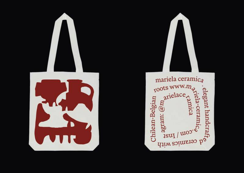
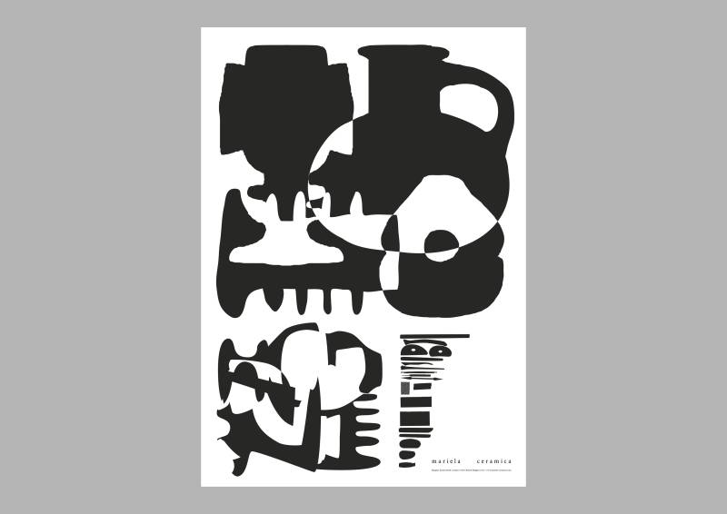
Mariela Ceramica
Totebag and Poster for an independent ceramic practice of Mariela in Ghent.

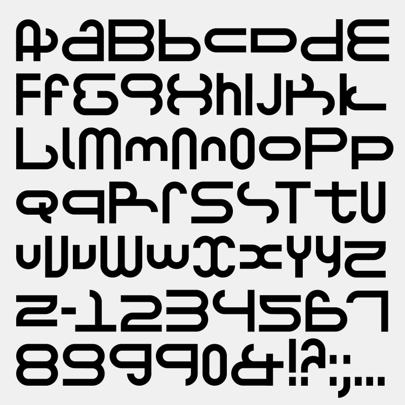
MUCE
Type Design
2024, i.c.w. Corbin Mahieu.
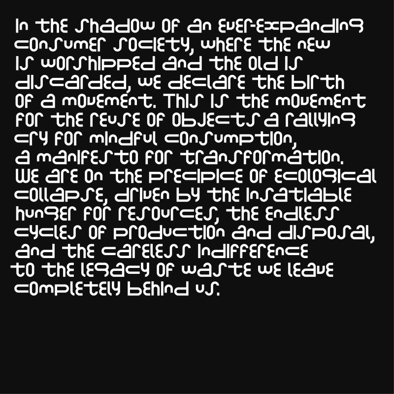
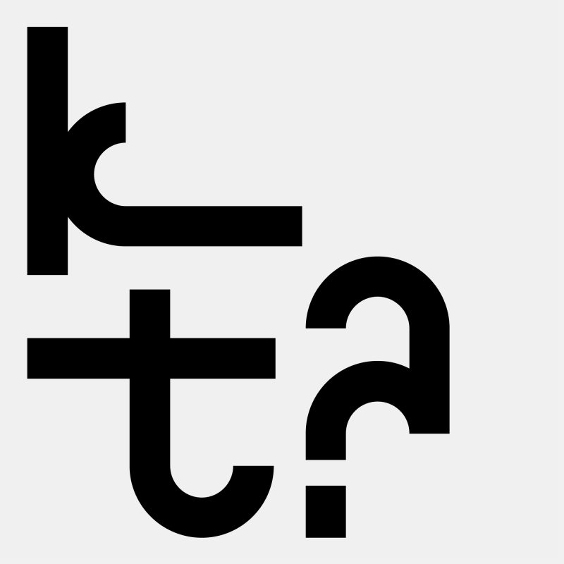
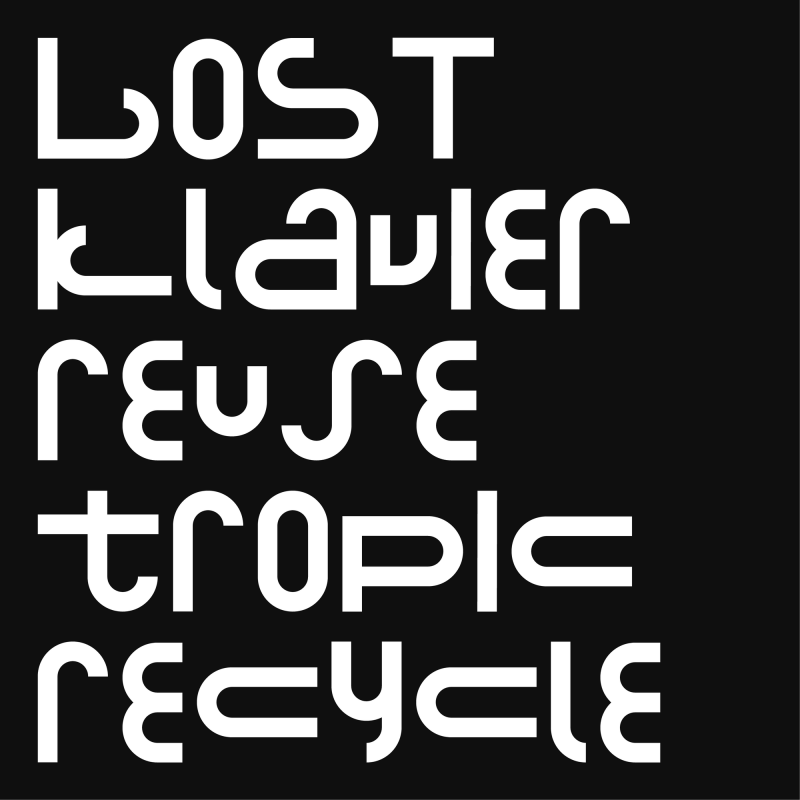
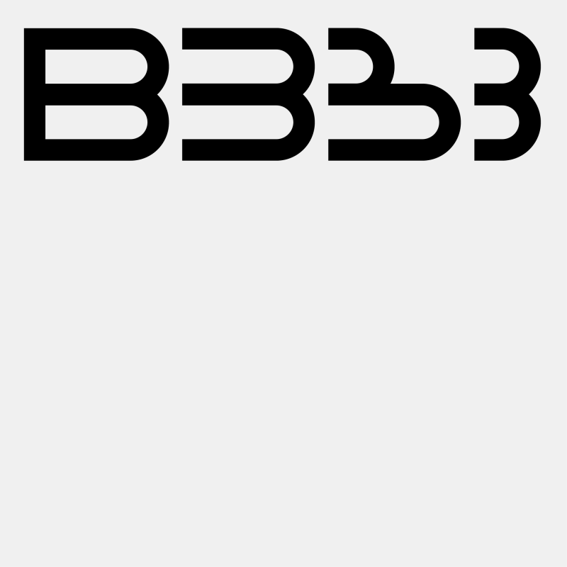
MUCE — a platform that focuses on the circular economy — contacted us to develop a fully functional typeface based on their existing logotype. The typeface is made by reusing a simple circular shape and represents the project’s values of sustainability and reuse.
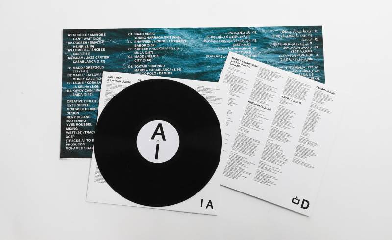
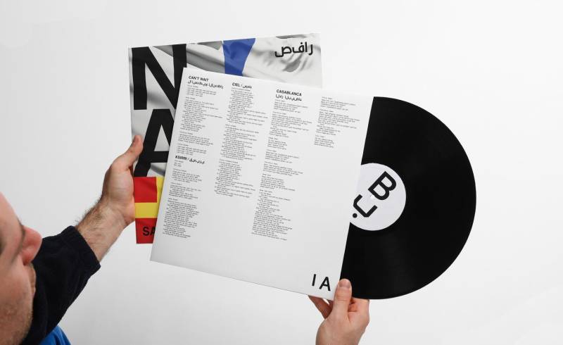
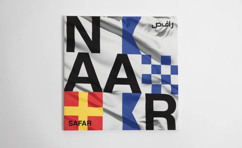
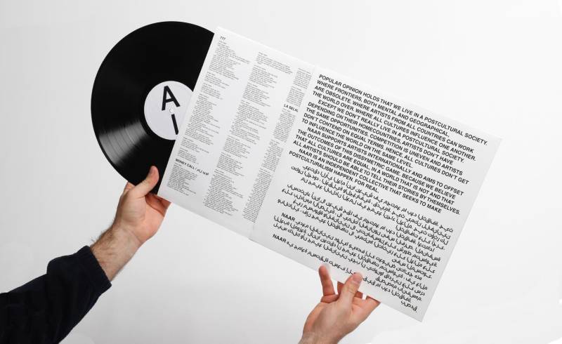


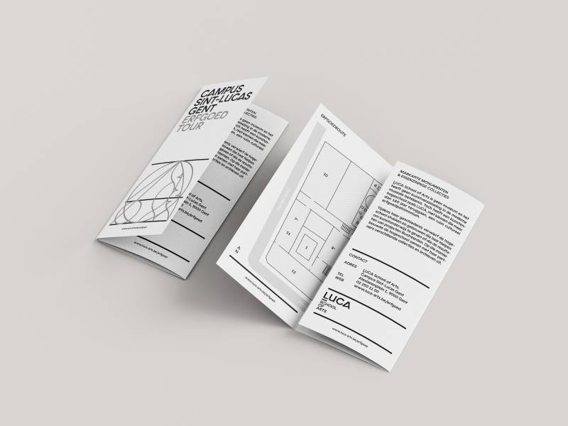
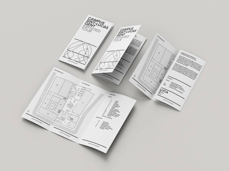
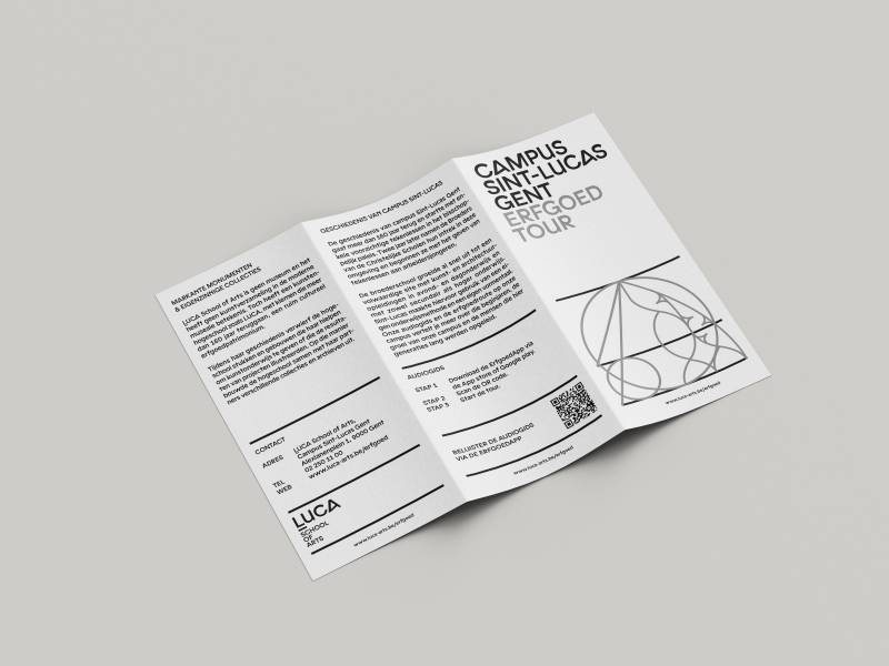
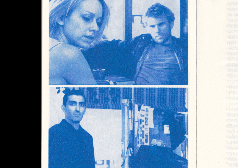
NAAR — Safar
LP Sleeve
LUCA School of Arts, 2021.
NAAR is a collective aiming for equalities for artists across all borders. The album Safar is a collaboration between Moroccan and Western (mostly French) artists. The sea is used as a metaphor for a place with no borders, a no man’s land. On the front, each letter of NAAR is encrypted in nautical flag alphabet. The same universal alphabet that is used to communicate on the sea. There is as little hierarchy as possible in the text to emphasize the horizontal values of the project.
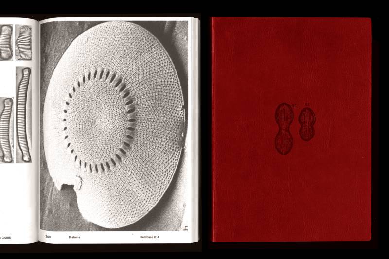
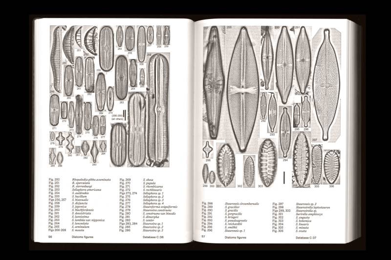
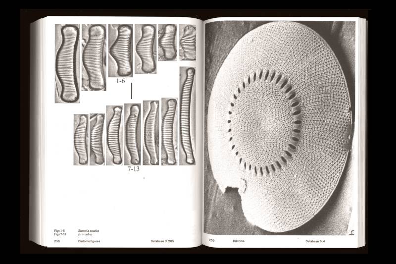
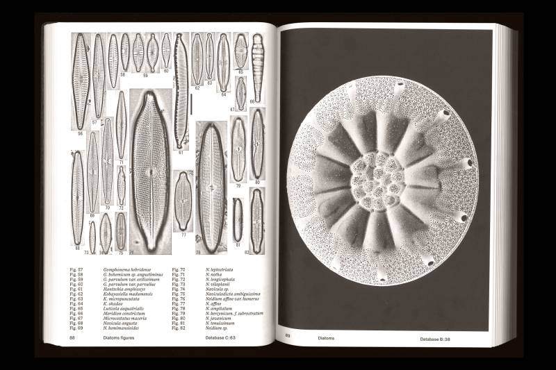
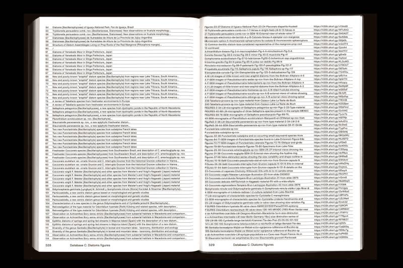
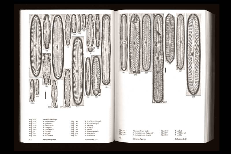
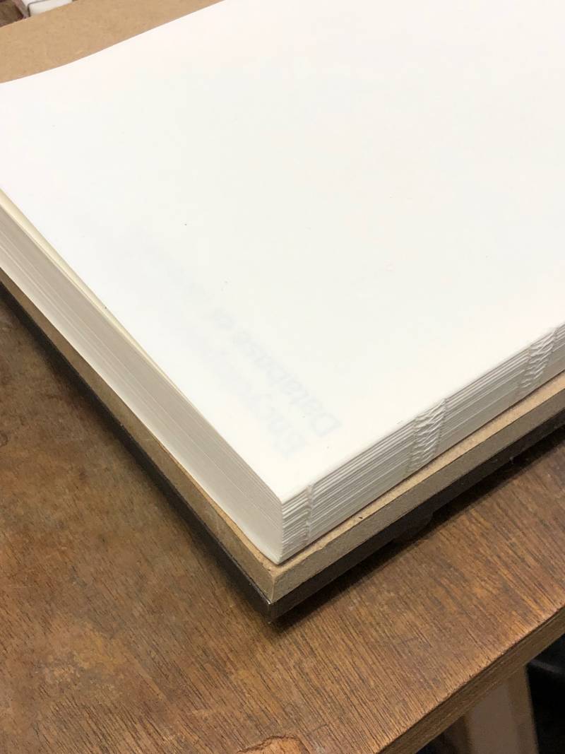
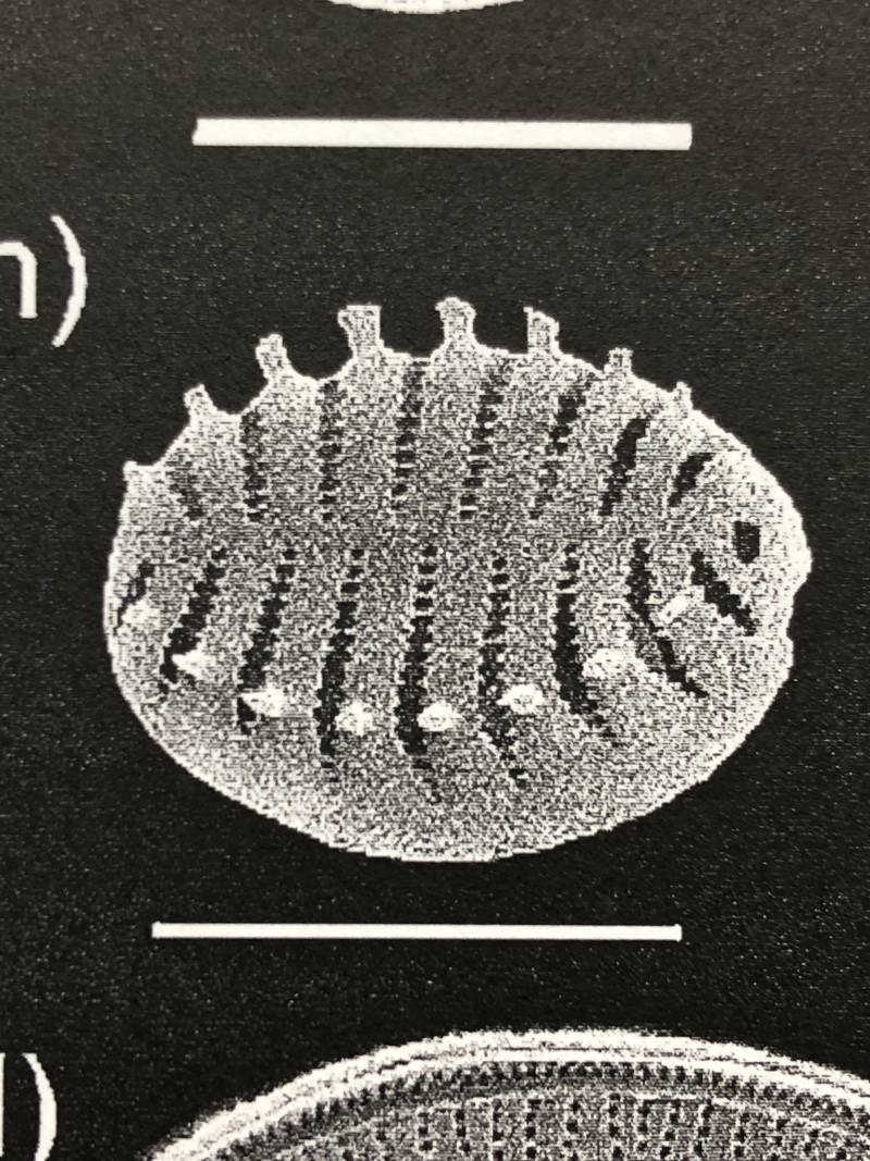
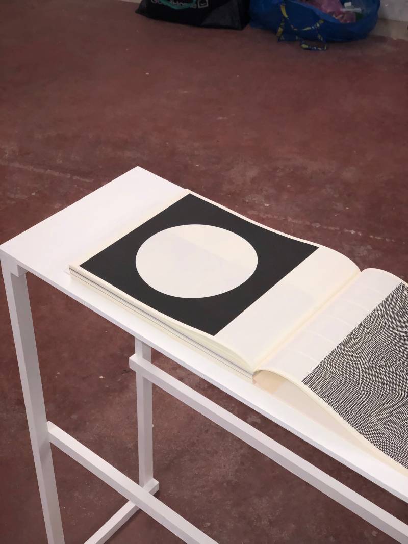
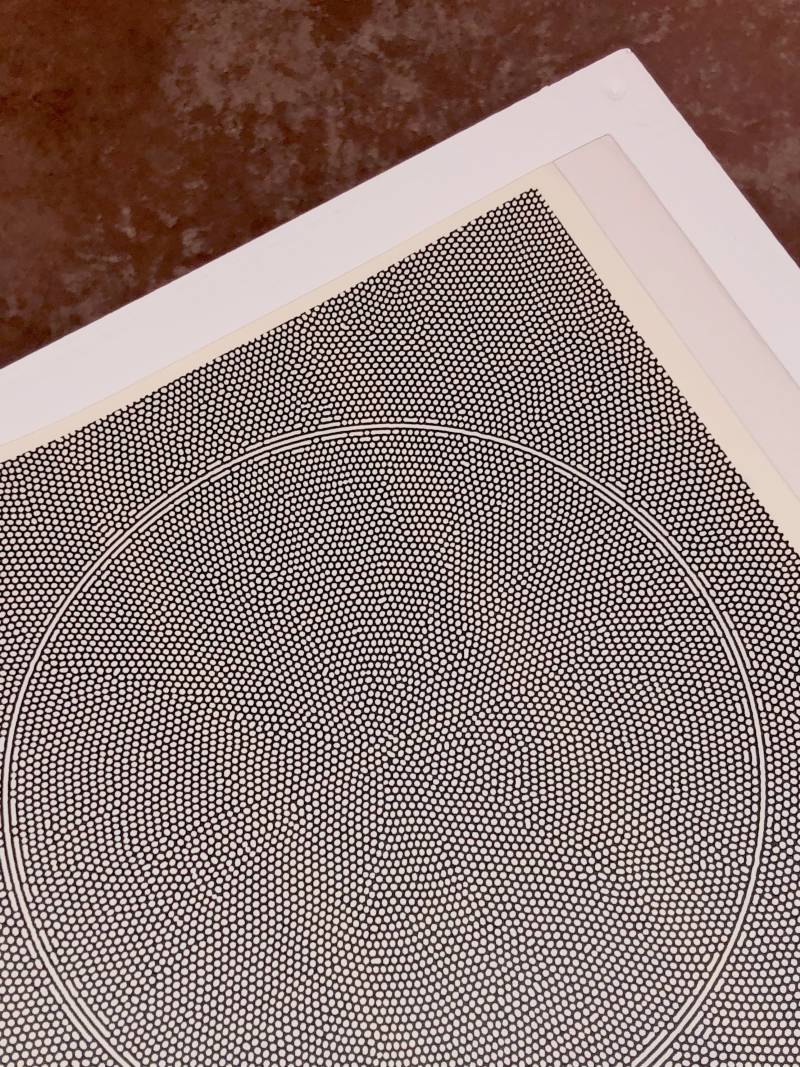
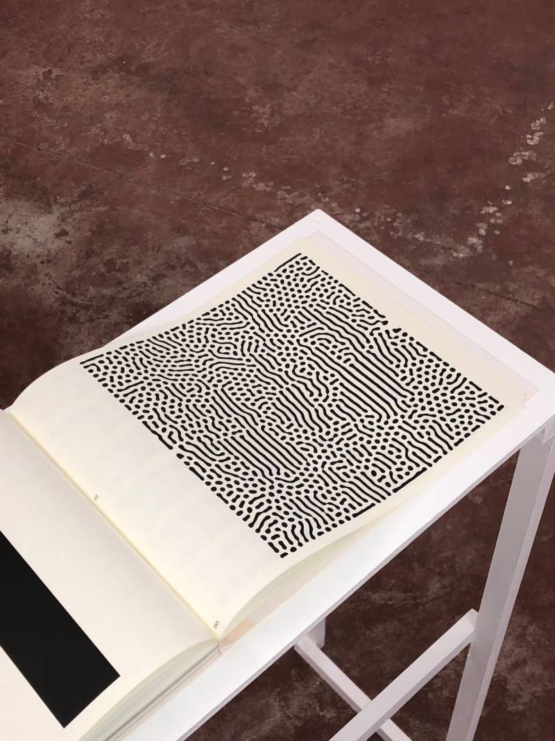
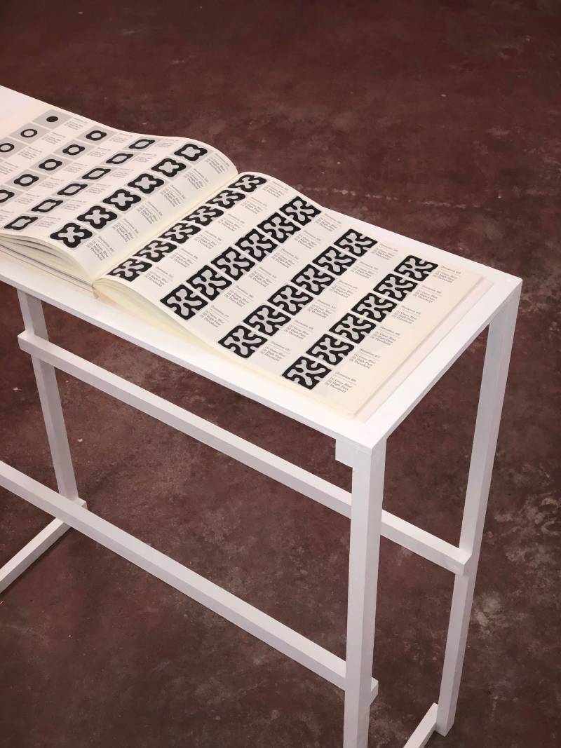
Encyclopedia of Diatoms
May 2022, 336 pages
Binding: Sahoko Yoshino
Paper: Munken Cream 80g
Cover: Red leather
Printing: Black and white (Magnetography)
Typeface: LL Bradford (Lineto)
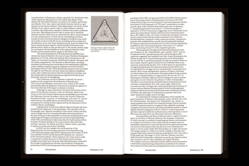
A diatom (from the Neo-Latin diatoma) is a type of microalgae found in oceans, rivers, and soils around the world. Living diatoms are a major part of Earth's biomass. They produce about 20 to 50 percent of the planet's oxygen each year, absorb over 6.7 billion tons of silicon from the water, and make up nearly half of the organic matter in the oceans. The silica shells of dead diatoms contribute significantly to marine sediment. Each year, around 27 million tons of diatom shell dust from the Sahara Desert, especially the Bodélé Depression, are carried across the Atlantic by wind, helping to fertilize the entire Amazon Basin.
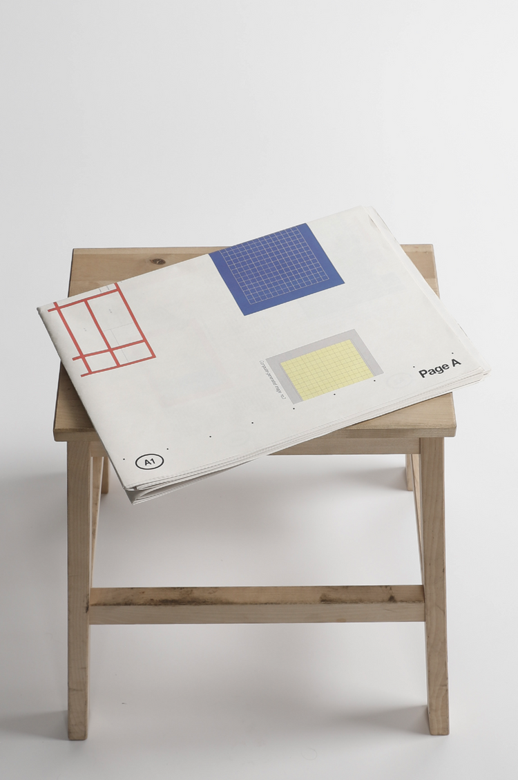
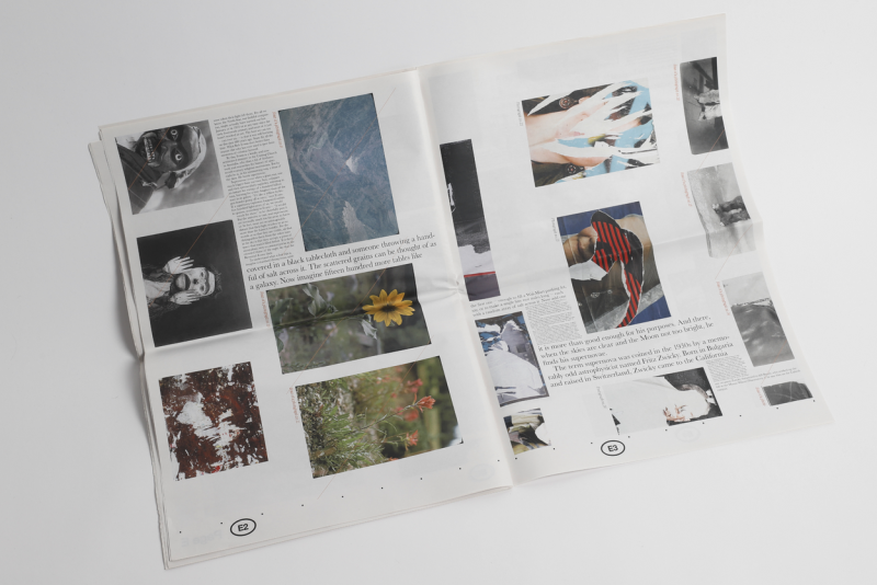
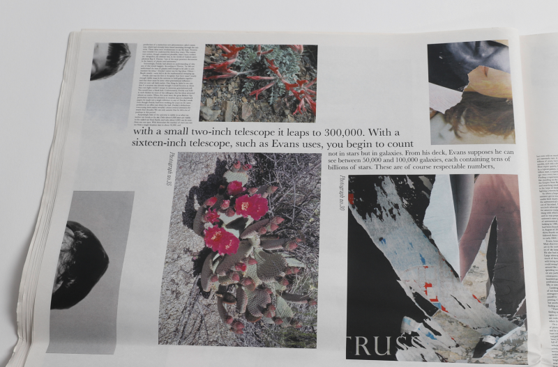
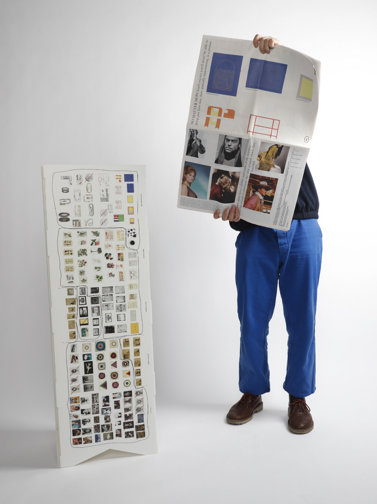
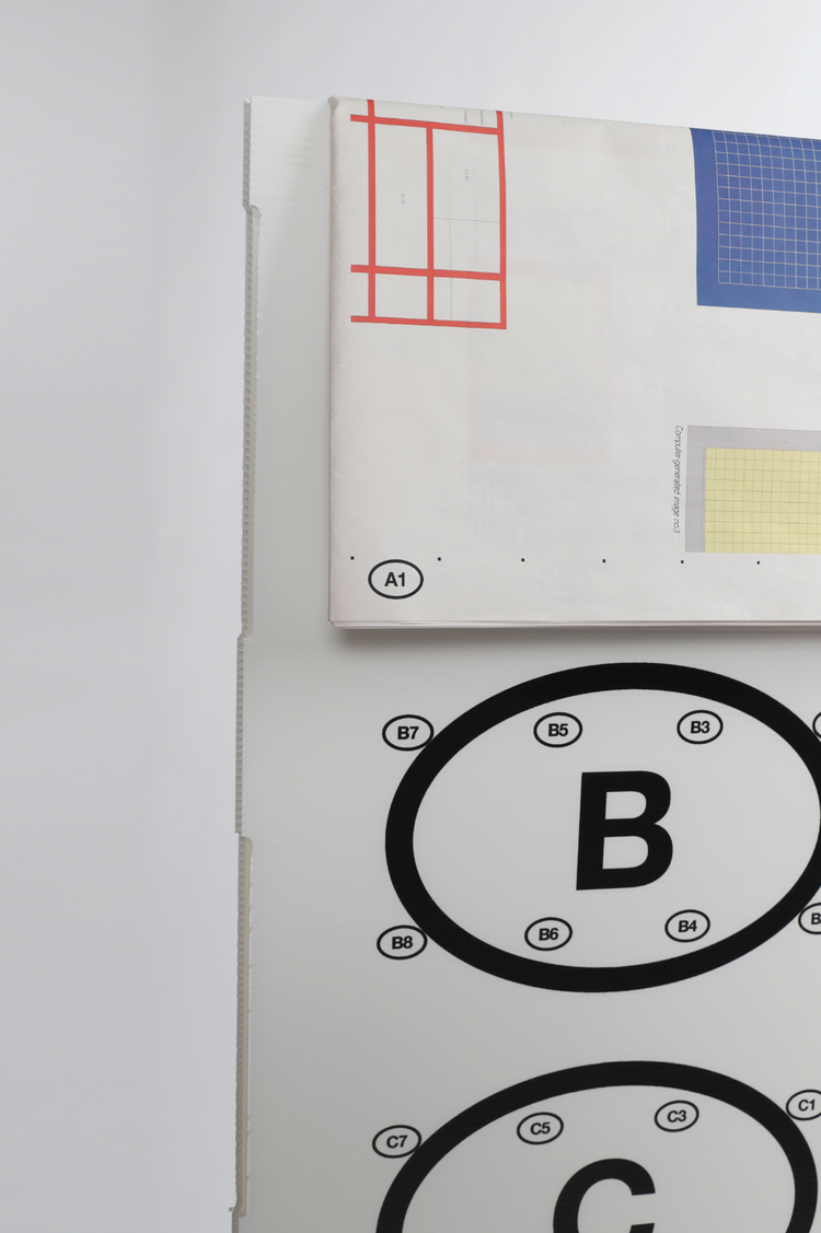
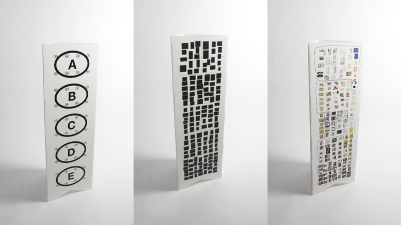
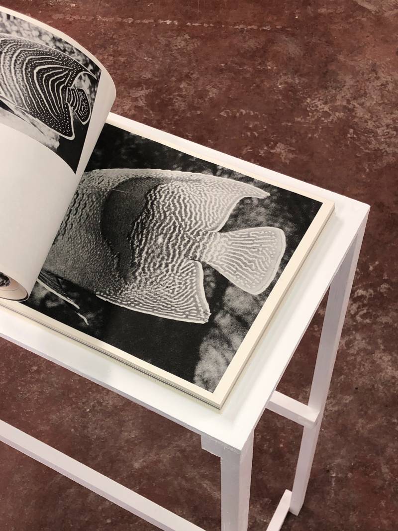
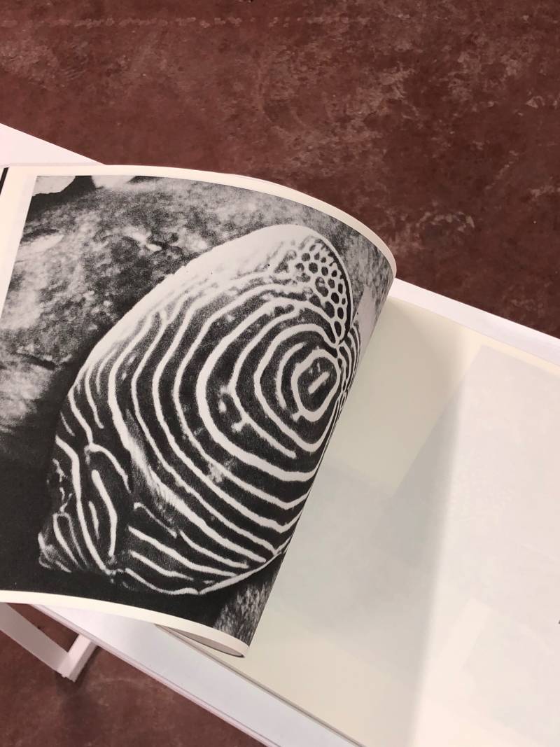
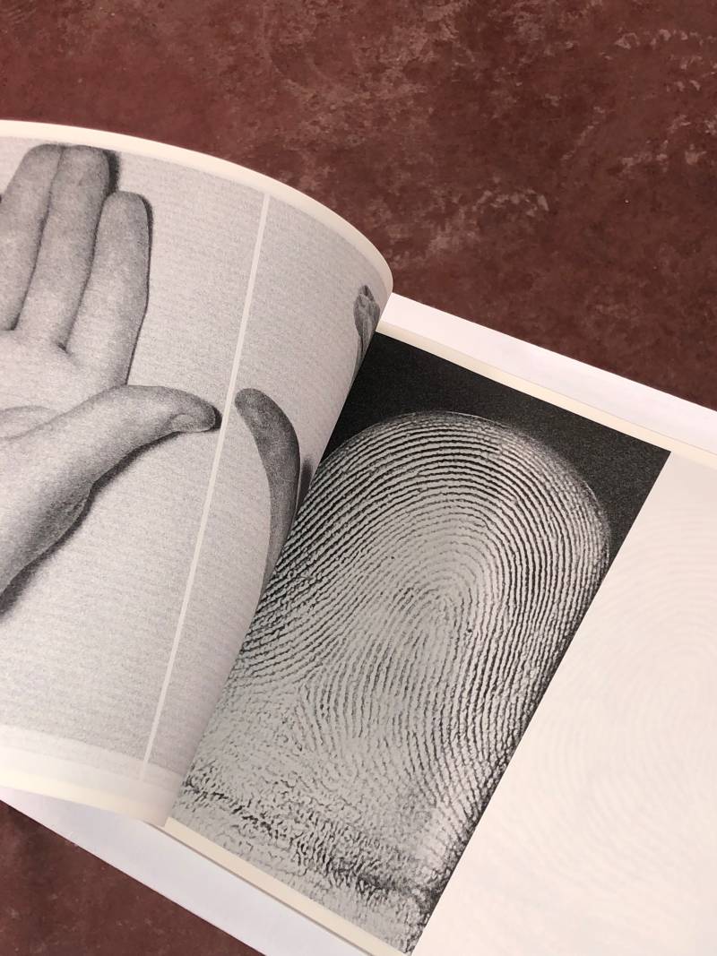
The Broadsheet Collection
Newspaper. 40 pages, 350 x 500 mm (closed).
The Broadsheet Collection is a collection of 140 images and a part of the text A Short History of Nearly Everything by Bill Bryson. The newspaper became and experiment where the typesetting is defined by the placement of the images. The images were first categorized depending on their graphic features and losely displayed next to eachother. Dividing this rectangle into 40 parts became the layout for the images. The typography is following the rule saying that a sentence should be around 10 words long and therefore it is changing in pointsized depending on the space the text finds. The accompanying standing sign works as a didactic tool to better understand the publication.
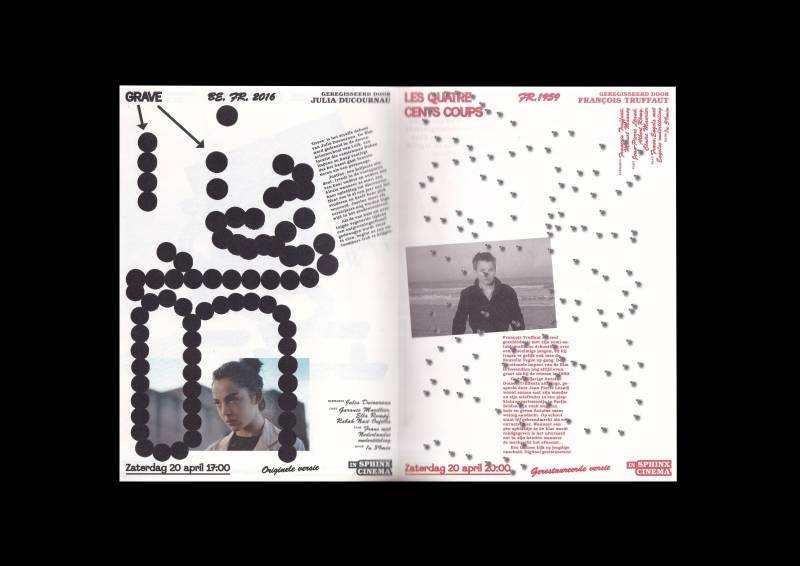
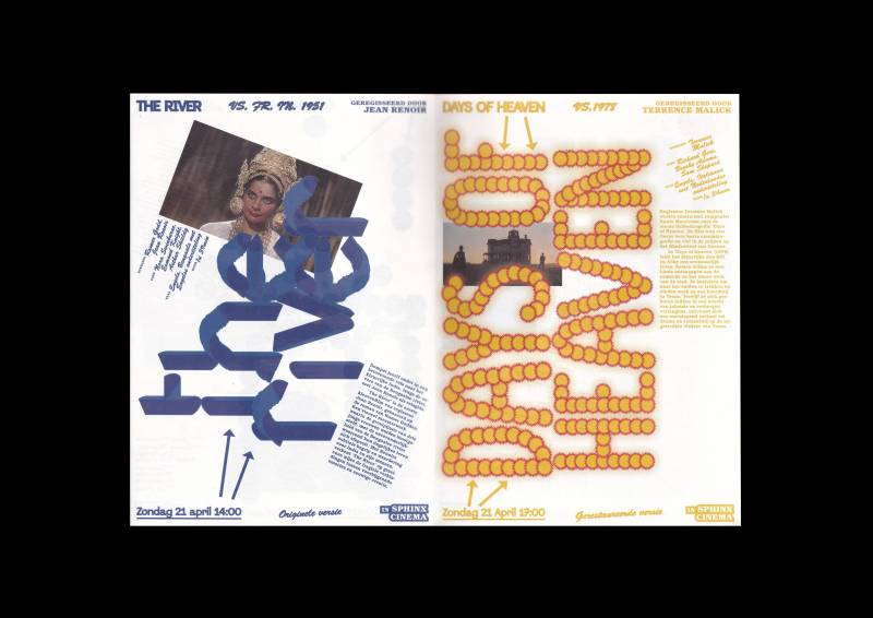
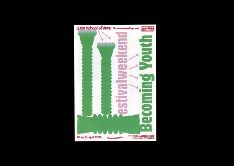
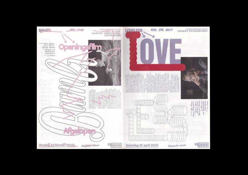
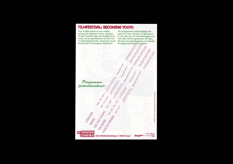
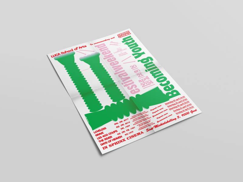
Sphinx Cinema Film Festival Weekend
Poster and flyer.
Becoming Youth is a filmfestival where youth is celebrated in all its forms. I chose to play with typography in an experimental manner, just like children and young people would do it. In coworking with my classmate who was also making experimental letters we developped a frame where experimental typography could live in. Every movie has a distinct typeface that is referencing the title of the movie while keeping this young experimental spirit in it.
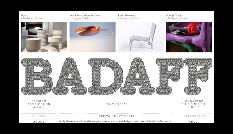
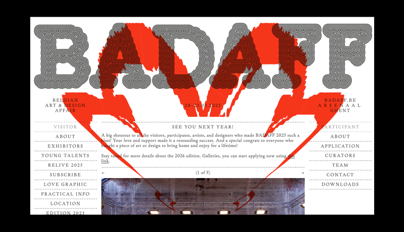
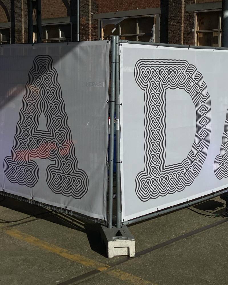
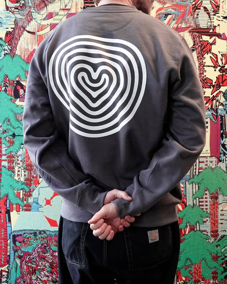
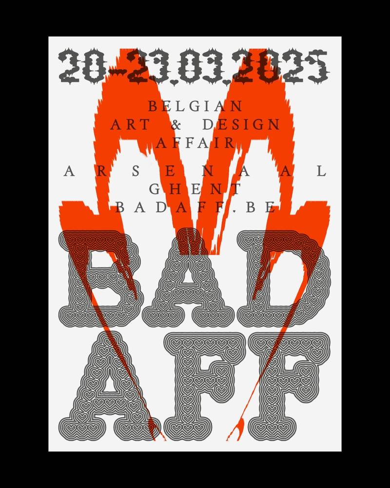
Belgian Art & Design Affair
Custom Typeface for Belgian Art & Design Affair
BADAFF is a unique fair for collectible artworks and design objects that are designed between the boundaries of these two worlds. Bringing art and design closer together creates a unique symbiosis. Sometimes one, sometimes the other, usually in between.
Abrupt Festival
2024, identity by Corbin Mahieu and Victor Verhelst.
For the promotion of the workshops of the festival, Abrupt required an animation showcasing the LAB program and it’s schedule.
Atelier Chora Architectes
2024, identity by Corbin Mahieu & Mathieu Serruys.
To announce their new visual identity, Atelier Chora Architectes required a motion design that could be used in several formats on their socials. The animation is strong in it’s simplicity by only using the three squares.
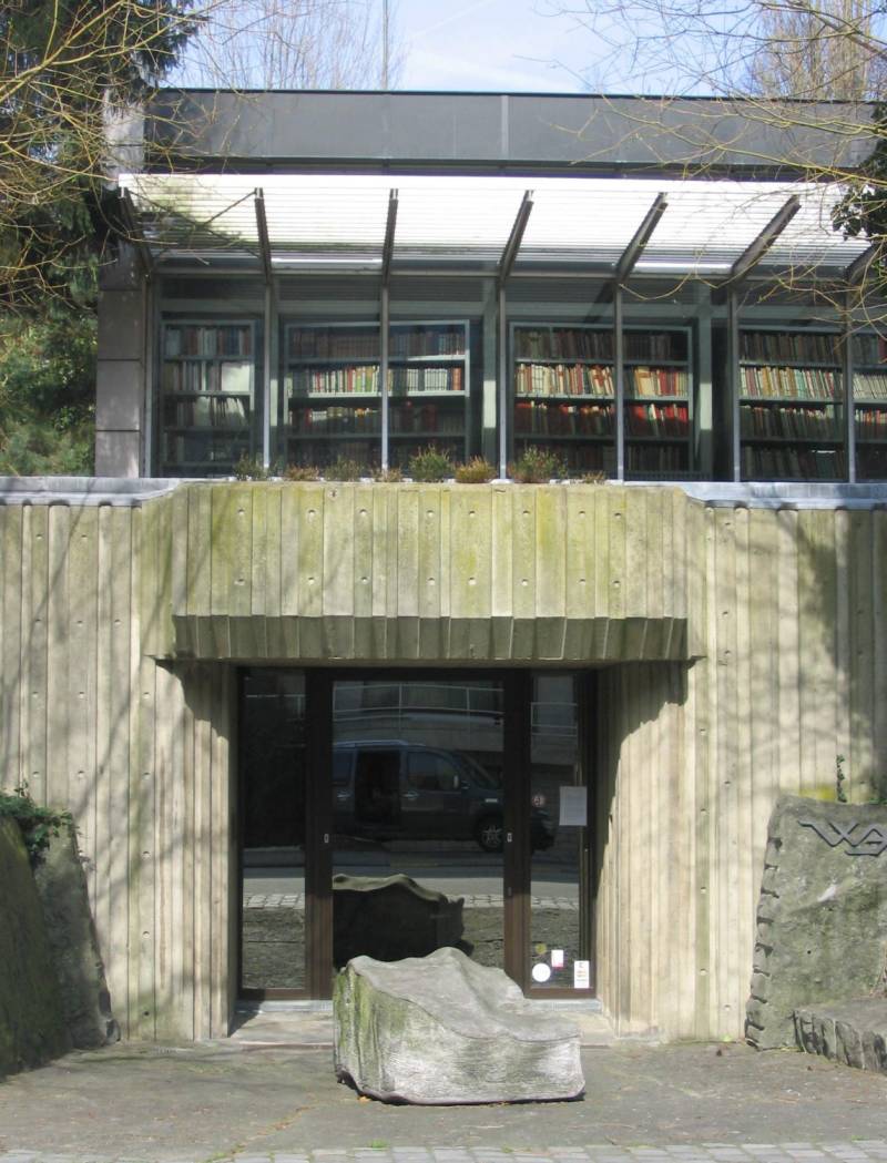
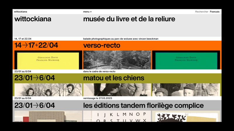
Wittockiana (WIP)
Wittockiana — Musée des Arts du livre et de la reliure (WIP)
Webdesign, 2025-Now
La Wittockiana, ou Musée de la Reliure et des Arts du livre, est un musée situé à Woluwe-Saint-Pierre, Bruxelles.
La Wittockiana, qui porte le nom de son fondateur, a été créée par Michel Wittock. Ce dernier a réuni durant sa vie une impressionnante collection de livres, manuscrits et autographes.
La Wittockiana est le musée des Arts du livre et de la reliure à Bruxelles. La collection, qui comporte près de 3000 ouvrages, est constituée de livres uniques : tous portent en eux leur histoire matérielle, le témoignage d’un ou d’une artiste, d’un ou d’une relieuse, ou encore la marque de leur auteur ou autrice.
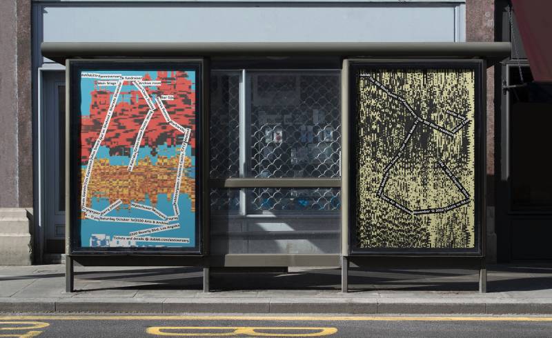
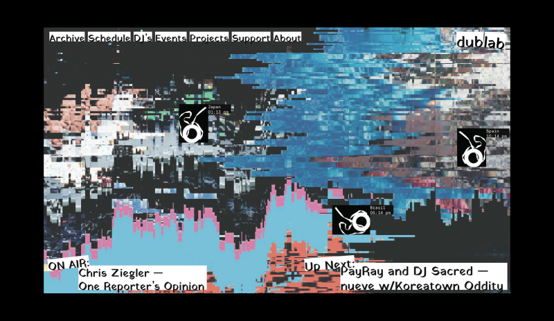
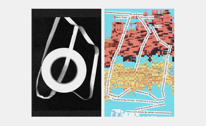
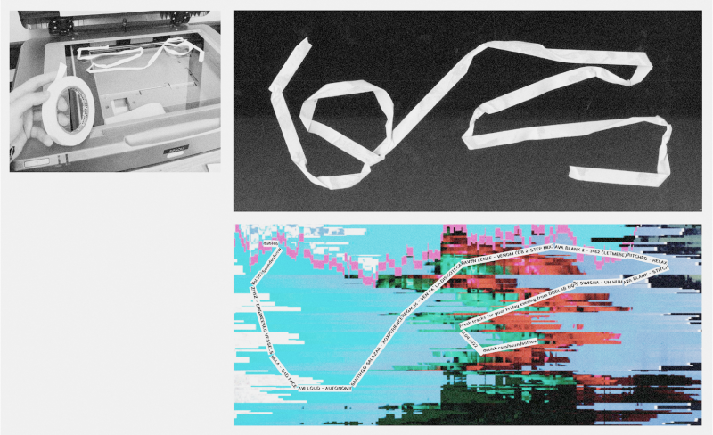
Dublab radio
Several formats.
Otis College of Art and Design, 2022.
Dublab is a Los Angeles based webradio creating community around arts & music. Focused on giving a platform for experimental music and because music is all about time, the identity is continiously evolving and experimenting. The radio communicates through this endlessy continuing piece of tape, that is scanned and used as the path for the typography. This way, creating a new asset is also a fun experiment for the person making it. Each piece is also unique and the background is created from the 15.000+ images found in their archive.
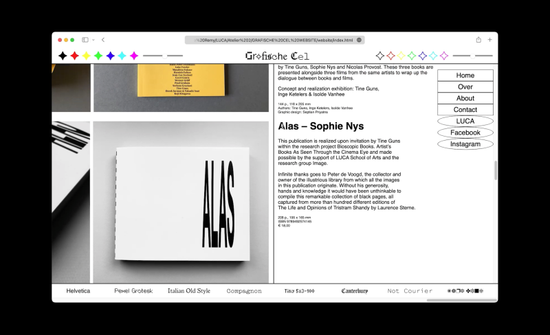
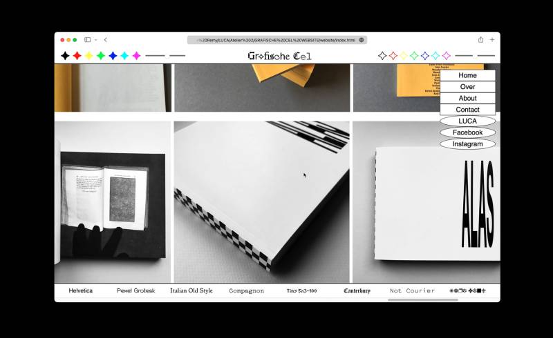
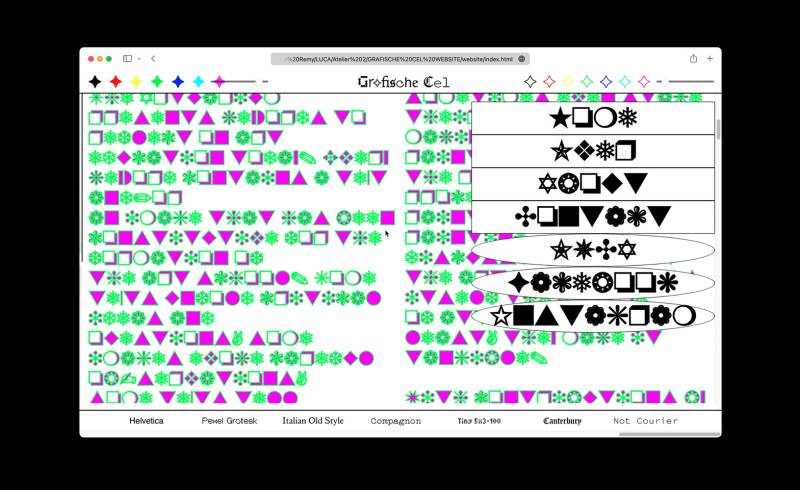
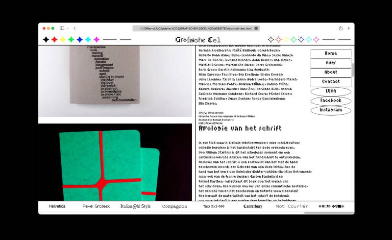
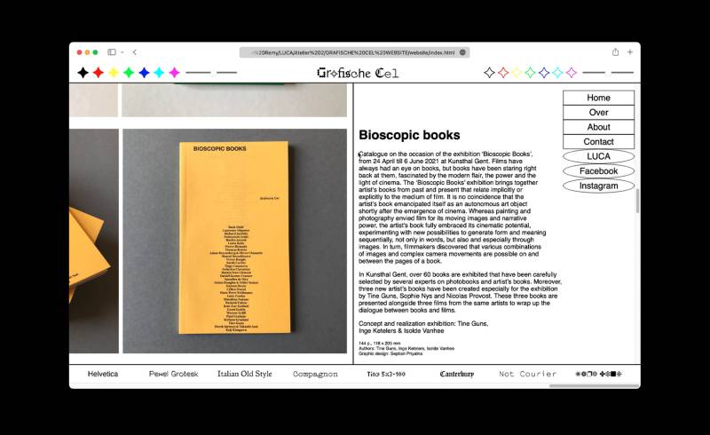
Grafische Cel
LUCA School of Arts, 2022.
Website for the publishing house of LUCA School of Arts called Grafische Cel. Besides displaying their catalogue, the website also works as a tool to play. Visitors can become graphic designers and change the fonts, and colors of the website in a playful way!
Movement Experiment
Several experiments with shapes in motion.
Kortrijk Art (Weekend)
2024, identity by Corbin Mahieu.
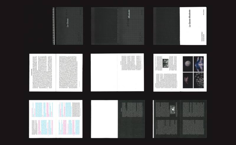
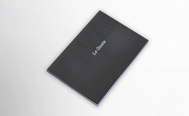
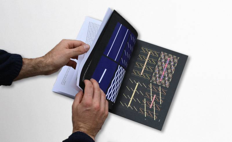
Le Geste Modeste
Master Publication
108 pages. 170 x 240 mm (closed).
LUCA School of Arts, 2024.
During my master I researched the possibilities of interaction between audio and visuals. The research resulted in a series of three interactive performances/installations. This publication holds my masterthesis.
The publication is also performative, by having the content flipped and a cover spread over two pages it asks for interaction and attention from the reader. It is divided in two main parts. The first part contains the artistic theoretical framework and is set on white paper. The second part focusses on the process of the projects and is set on a black background as a reference to the black box that is used for my performances.
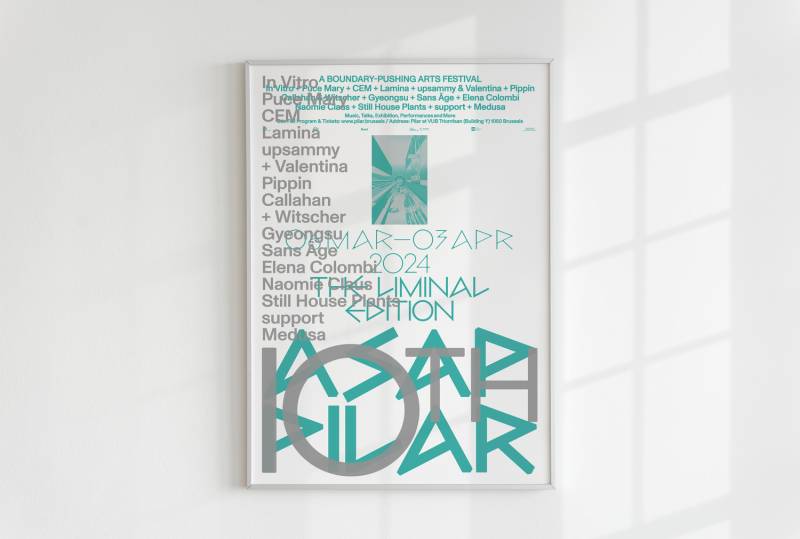
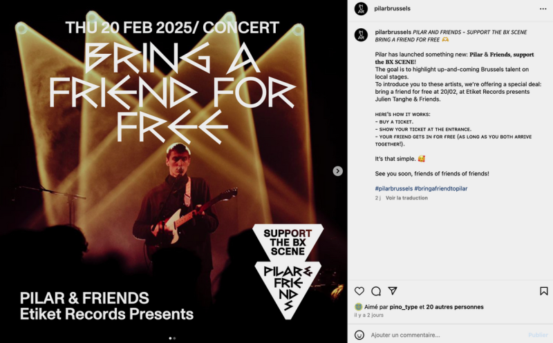
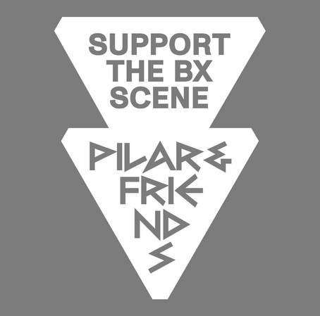
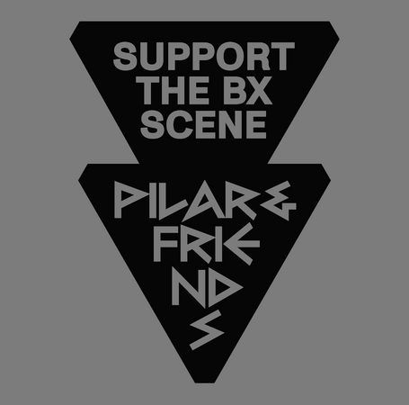
PILAR
10th Edition Poster. Format A2. Leporello. Social Media Labels.
i.c.w. Studio Corbin Mahieu, 2024.
On the occasion of the 10th edition of the ASAP PILAR Festival I had the opportunity to design a poster that would reflect that special event. Since the structure has been the same for the previous editions, we thought it would be great to keep it and only add an extra-layer in print, highlighting the line-up and the special edition.
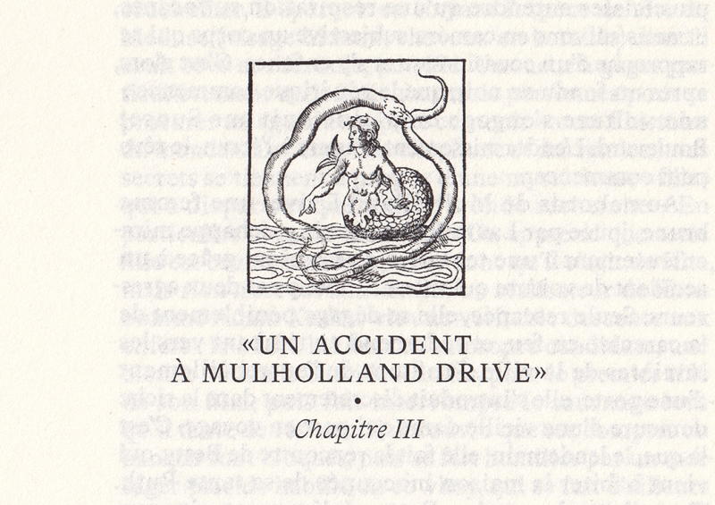
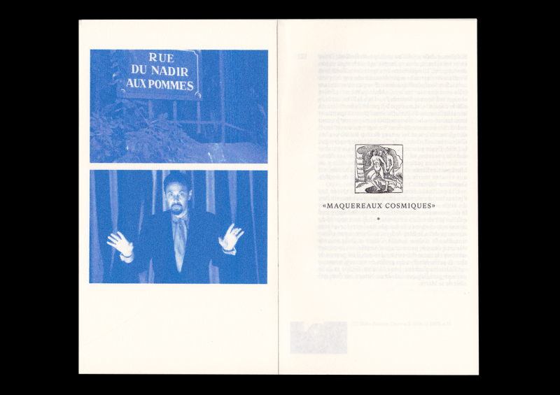
La clé des songes
Micro-édition
Réédition Pirate de l'essai de Pierre Tévanian "La clé des songes"
Au sens propre comme au figuré, Mulholland Drive est un film à clef. Il y a d’abord, dès le commencement, cette mystérieuse clef bleue trouvée par les deux héroïnes au fond d’un sac. Plus profondément, il y a le fait que cette clef elle-même doit être pensée, interprétée, déchiffrée par les spectateurs et spectatrices du film pour résoudre un mystère – et même plusieurs. Le mystère d’abord de l’identité perdue d’une des deux héroïnes devenue amnésique, pour qui la clef bleue est, avec une liasse de billets (trouvée au fond du même sac) et le double souvenir d’un nom de lieu (Mulholland Drive) et d’un nom de personne (Diane Selwyn), la seule trace à partir de laquelle une histoire peut être reconstituée.
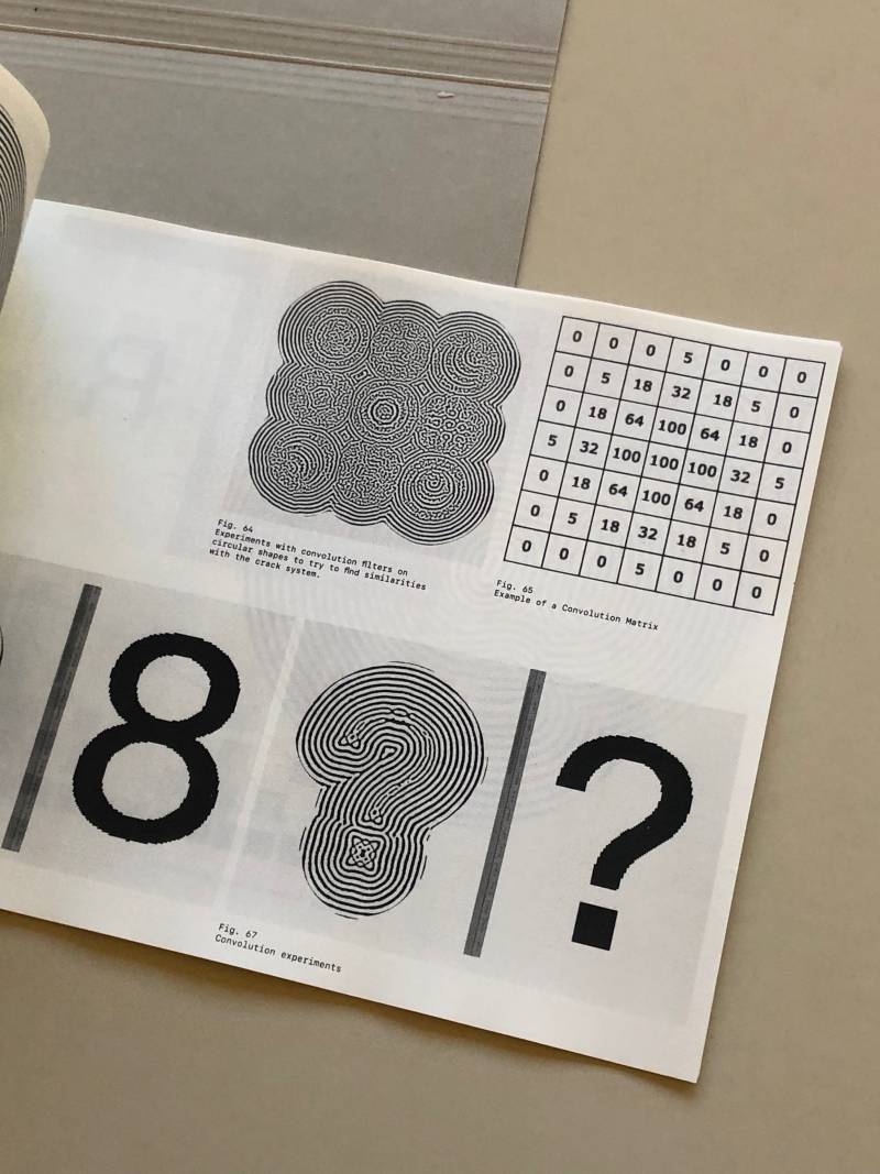
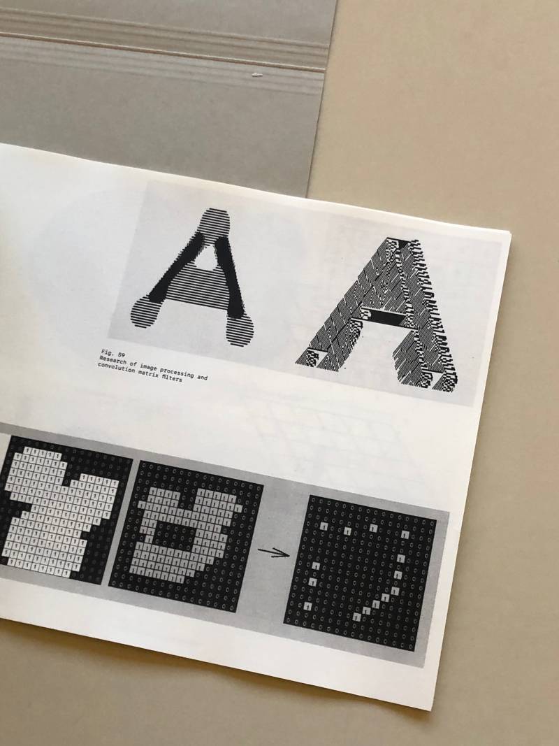
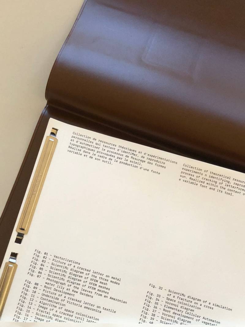
Crack System
Research project carried out as part of the production of a variable font.
A collection of theoretical resources and personal experiments that try to identify, reproduce, and automate the process of cracks in typographic shapes caused by the sun.
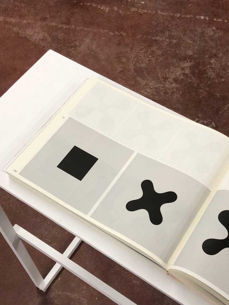

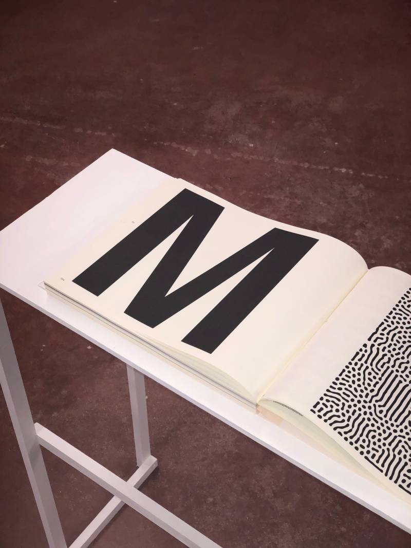
Poetic Program — Image Processing as a System
2023, 304 pages
Binding: Sahoko Yoshino
Paper: Munken Cream 80g
Printing: Black and white (Magnetography)
What kinds of relationships can exist between poetry, natural forms, programming, and typography?
How can complex organic shapes be generated from a set of simple rules?
Through the study of organic structures in nature, how can we identify, extract, or model the systems that compose them, and then reproduce these systems using machines and algorithms to create new graphic forms?
How can image processing algorithms be used to generate new organic or typographic forms?
In what ways can randomness be used as a creative engine to guide the production of graphic signs within an algorithm or system?
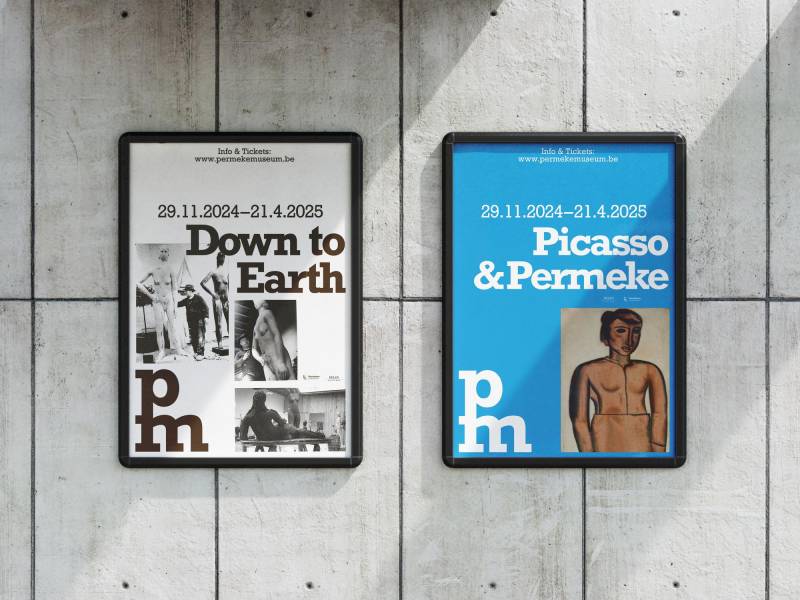
Permeke Museum
Permeke Museum
Poster Campaign & Social Media Rebrandi.c.w. Victor Verhelst, 2024.
Within the existing visual identity for Permeke Museum made by Victor Verhelst I modernised the look of the posters. The old posters were not dynamic enough so I came up with a new more dynamic typographic template that is now used for the posters of the museum.
Wintercircus
Motion Design
2025, Cavalry & After Effects.
Several motion outputs for Wintercircus Gent, a building that was once a circus and is now repurposed as a public venue. Working with the already existing identity by Zware Jongens.
S.M.A.K — Pop Art Exhibition
Motion Design
LUCA School of Arts, 2022.
Instagram campaign for the Pop Art Exhibition at the museum of contemporary art S.M.A.K. in Ghent. The font is literally popping in our faces. The iconic Google Earth zoom is used here as a way to make the museum
a tangible place to motivate people to come visit. Plastic Bertrand is the most pop art artist Belgium has ever known.
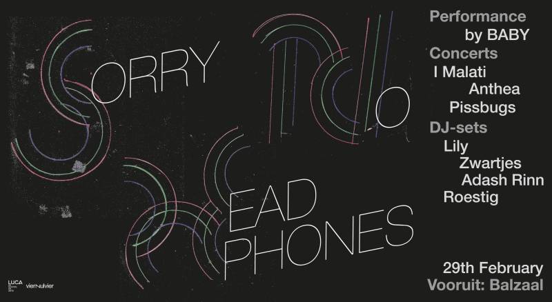
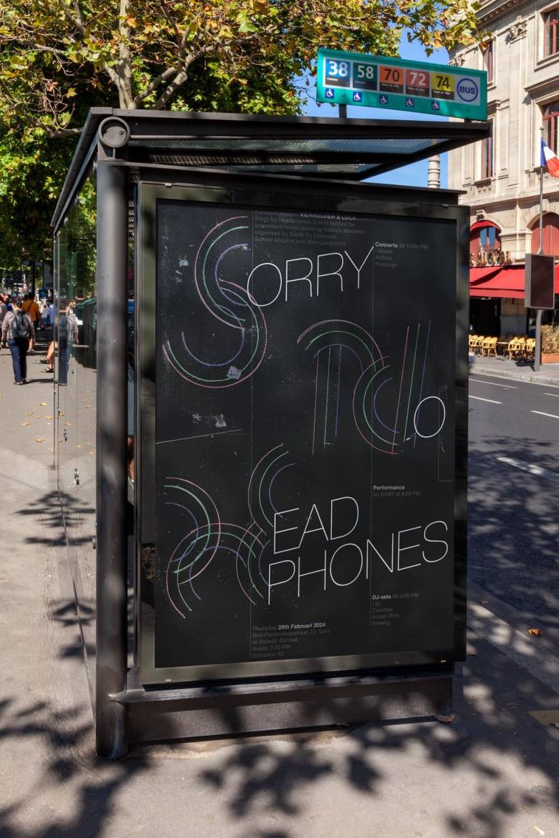
Sorry No Headphones
Visual Identity Poster, banner, motion.
Sorry No Headphones is a music festival organised by LUCA School of Arts where students can perform as musicians, performers and DJ’s. We are leaving our individual digital headphones to come together to celebrate music. The non-digital aspect was a starting point for the conceptual framework.
Woodcrafts And Textile Futures
Image and video dithering tool developed for the visual identity of Woodcrafts and Textile Futures Developed by Jérémie Claes (@bureauclaes) in collaboration with Corbin Mahieu (@corbinmahieu) for Woodcrafts And Textile Futures (@watf.news)
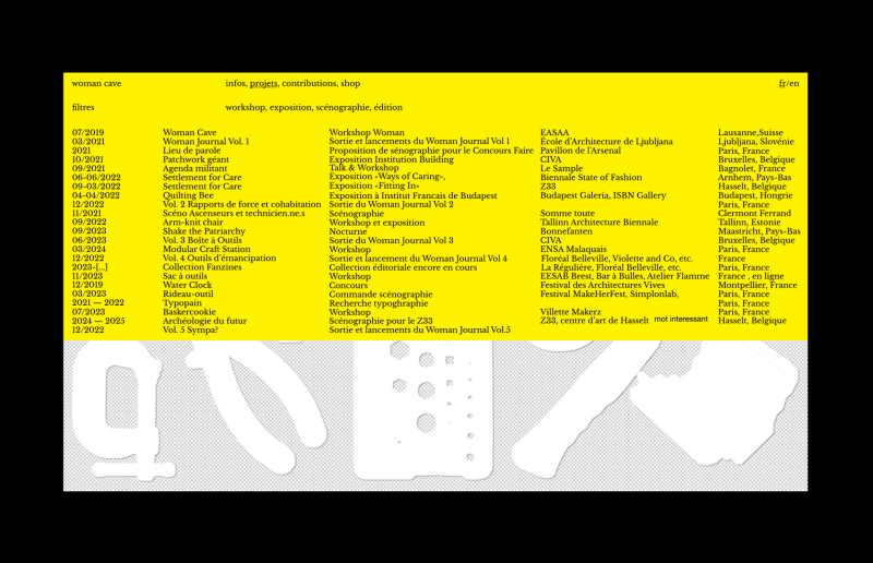
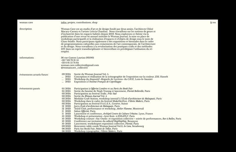
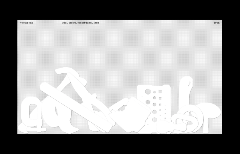
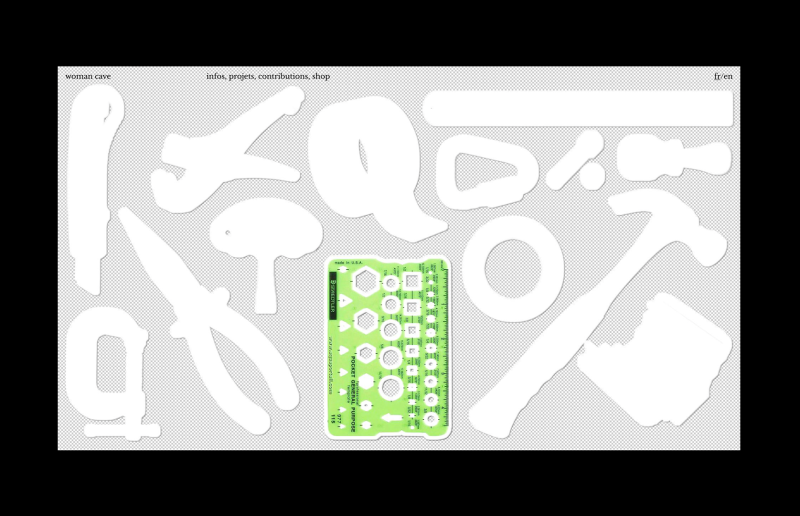
Woman Cave
Website for Woman Cave
Woman Cave is a multidisciplinary collective that explores gender-related issues in inhabited spaces. It operates as a design and architecture studio, publishes a biannual magazine titled Woman Journal, and also takes part in exhibitions while organizing workshops.